Tuesday, September 29, 2009

Object Swap

Making Memories recently had a challenge based on the song lyrics "Every generation has a chance to change the world."  A picture of my son sprang to mind.  In it, he was holding a big green balloon.  I decided to see if I could turn it into a globe. 

I first removed the string and tie.  Then I pasted a globe onto a new layer.  Tip: By adjusting the opacity of the globe, I could see where his fingers were (so I knew exactly where to erase).
  

I look forward to hearing your thoughts! 

Sunday, September 27, 2009

No Anne Geddes

I'm no Anne Geddes, but I have to experiment on something while I learn about Photoshop.  Here is the fruit of today's labors:


Saturday, September 26, 2009

Photoshop Magic?

As soon as I saw this picture of my daughter, I knew I wanted to play with it.  I had dreams of adding a little magic with fairy-like sparkles. 

I first changed the color of the background (as done in the post, "A Beginning").  I gave it a soft blur and brightened her up a bit.  I then added a layer of texture (64% opacity) and smoothed it over her face and arm (as done in "Photoshop Textures", with the healing brush). 

I think it lends her an ethereal quality and the sparkles I've tried so far have just looked cheesy.  I'm continuing my research and this may not be the final incarnation of this pic, but I thought I'd share with you what I've done so far. 

With Halloween approaching, how do you add magic to your pics?

Tuesday, September 22, 2009

Routine charts

My son used to love his My Go To Bed Book.  When my husband had to be gone for 6 weeks, I scanned some of the pages and turned them into a bedtime routine chart.  It worked like a charm!


Now that he's old enough to make his bed in the mornings and with the approaching turmoil of a deployment, I've added a morning routine chart.  We didn't have a book that fit the bill, so I had to improvise.  For "wake up" I googled the phrase "happy sun" and the kids picked this one (quite emphatically, I might add). 

To make a chart, simply print your images, glue them to 8x10 cardstock, laminate, add 2 eyelets to the top, and hang with fun ribbon.  They're extremely durable!  I might even make an afternoon chart for the things they do when they get home.  (Put shoes away, set the table for dinner, etc.) 

I can't wait to hear your thoughts!  What are your best tips for mornings/bedtime?

Update:  My son requested a green chart for the afternoon.  Here it is!


Monday, September 21, 2009

Decorative Packing Tape

I always clean my home thoroughly before going on vacation.  It's such a wonderful feeling to come home to a beautiful and clean home! 

I'm having similar ideas about the boxes we'll be putting in storage.  Everybody knows to designate boxes according to their rooms and I'm doing just that with a whimsical twist, using decorative packing tape.
Maybe polka dots for my son's room and birdies for my little girl?  Here are the rolls I've purchased so far:


Not only will we know where each box goes, but there will be a little something to make us smile.

What are your best moving tips?

Saturday, September 19, 2009

Toddlers Telling Time

Today's obsession is how best to mark the passage of time while Daddy is gone. 


The first strategy involves apothecary jars filled with jelly beans (1 for each day of the deployment).  Each day, the child gets to eat 1 jelly bean.  To avoid fighting, we'd need a jar for each child. 

A fun thing to do before my husband leaves would be researching which jelly bean flavor is each child's favorite. Then, each jar could be filled with their favorite flavor bean!  I can imagine my son choosing the buttered popcorn flavor because he often eats popcorn with Daddy.

The second strategy is a paper chain.  Each day, one link is removed from the chain.


I like these because they're patriotic without being over-the-top.


These are gorgeous, but wedding-themed.  I'd have to custom print the paper with messages from Daddy for each day and markers like "Halfway there!"


My final conclusion?  I need a better way to cut my scrapbook paper with these cute patterned edges!  (The little scissors never work very well for me.) 

What ideas do you have to mark the passage of time?

Growth Chart

Admittedly, I've been out of commission for a few days while reading the new Dan Brown novel.  Not wanting to shirk my blogging duties, I'll share with you a project I completed a few months ago: a growth chart.

Being a military family who moves often, we needed an alternative to tracking our kids' growth on a doorframe.  Many growth charts commercially available are too cartoonish and furthermore, too small!  My son could easily grow past 6' and I'd like to be able to chart the whole way.

The solution:  I purchased a 1x4 and placed it on the wall at the height I wanted it to be.  Then, I placed a tape measure over it (starting at the floor) and taped it to the wood.  I woodburned the ruler markings into the wood.  I also woodburned the family name into the top of the growth chart.  Two coats of natural polyurethane and it was finished!  Here are some pics of the finished chart (with the names of my children removed):

Wednesday, September 16, 2009

Today's Tip

I love tips, hints, and tricks!  I thought I'd share one with you today:
Another use for air freshener
Instead of spraying air freshener willy-nilly around your home, did you know it does an excellent job cleaning mirrors?  The pleasant scent it leaves behind is a bonus! 
What's your best household cleaning trick?

Sunday, September 13, 2009

Kids' Costumes

The kids' costumes have been completed! 
My daughter's overdress turned out like this:
Because the dress still had the zipper in the back, I sewed the bow closed in the front.
I found an awesome blouse in her closet.  Unfortunately, it was too long to be just a blouse, and too short to be used as a chemise. 
I bought some plain white muslin and fashioned a skirt that I sewed to the blouse, above the ruffled part. 
The result?  A chemise that can be turned back into a cute blouse with a simple rip of a seam! 
Here are both pieces together:
Being modeled by my cuties:

A Highland Halloween

Halloween costumes have begun! 

Last year, we were a Viking family:


This year, we'll be Scottish Highlanders (my cultural heritage).

My Grandfather bought a gorgeous kilt for my son, and hand-made him a sporran.  I've altered a plain white oxford shirt for him to wear with it, adding eyelets and leather cord. 
He sent my daughter a red plaid dress that looked something like this (I forgot to take "before" pictures, so pardon the Photoshopped rendering):
I removed the velvet bow and trim and split the dress open down the front.  I added eyelets at the top of the dress (above the empire waist).  The top is laced together with thin black ribbon.  Now I need to make her chemise and the kids will be all set! 
Costumes for the adults will require actual patterns, but I'm excited to improve upon my sewing abilities.  And I do love a project.  : )
I hope you're also having fun with scissors and seam rippers! 
What are your plans for Halloween?

Thursday, September 10, 2009

Fall fashion update

I've donated a bunch of clothes to charity, but some remain that require alteration.  I'll occasionally splurge on a tailor for complicated waistband stuff or princess seams, but I'll often just take to my clothes with a seam ripper and hope for the best. 

This summer, I bought a couple tanks that looked horrible on me as they were.  After shortening the straps, they've been go-to pieces.
Last night I attacked some blouse sleeves.  I'll try to do the alteration when I get the sewing machine out (I need to start on Halloween costumes anyway).  Worst case scenario:  I'll have a tailor make shells of them!  
The bottom line is that a little bravery goes a long way.  Wish me luck!   

Wednesday, September 9, 2009

Fall closet update

As you already know, I'm in a frenzy of purging.  Yesterday, we sent two boxes of baby clothes and shoes to my sister, a box of books to my husband's office library, and a box of books, a bag full of shoes, and two bags of clothes to Goodwill.  Progress is being made! 

Parting with beloved items can be difficult, so keep these principles in mind:
There's no point in storing items that you don't wear, are worn out, outdated, or don't fit.
If it's not flattering, it doesn't fit.
Keep in mind the lucky recipient of your donation!

It's time again for a change of seasons, so now is the perfect time to update your wardrobe.  Anything you didn't want to wear this summer, you probably don't need to keep around for next summer.  Also donate anything you loved to death this summer.  Decide which of your Fall wardrobe you will use again this year, make any necessary repairs and donate the rest. 

Don't only look at your clothing- go through your shoes, purses, and makeup as well.

A neat trick to try this season:  As you put the 'keepers' away, put the hangars on the closet rod backwards.  As you wear an item and put it back, put the hangar on forwards.  At the end of the season, you'll know exactly which clothes you were actually wearing and which ones didn't make the cut. 

A similar tip for items in drawers: Pin a safety pin to the tag of each item, which you remove when you wear.

An edgier tip:  Put off doing laundry for as long as you can.  When you start running out of your favorite clothes, you'll see which items you refuse to wear (even when you're out of options) and which ones you only wear reluctantly.  Those are the clothes that go. 

Happy wardrobe decluttering!

Tuesday, September 8, 2009

Mother's Day Photo Shoot

I wanted to do something special for Mother's Day this year and, naturally, I thought of photos. 

I gave my son a heart "tattoo" using longwear lipstick.  With scrapbooking stickers, I spelled out "Grammy", then "Grandma", and finally "Mom".  I outfitted my daughter in a Mom tattoo t-shirt.  Here are some of my faves:

I had the bottom picture enlarged to 24x36 and printed on canvas.  I framed it and it hangs in our dining room.  Tons of people have asked about the background.  Did I take it at the beach and then wash out the colors?  Nope.  It's a white backdrop!  All these pics were taken in our backyard.  

Sunday, September 6, 2009

Minimizing

 In the past, I've had precious items lost or damaged during a move.  This time, we're going to try packing ourselves and using a POD.  It's an exciting possibility, but it means that we must fit all our worldly possessions into an 8x8x16 foot box...  Therein lies the problem. 

Some of the decisions are easy:  Of course we'll sell the old sofa, give away the wall heater covers, etc. 

Some are less clear:  How do you get rid of picture frames without knowing which ones you'll want in the new house? 

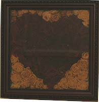
And some require getting creative:  When my husband proposed to me in Boston, he did an amazing job of it!  It's a long story that ends in a room filled with 20 dozen long stemmed red roses.  I dried them and enjoyed having them hung around my room.  They were boxed and moved with me to Ohio.  They remained in the boxes.  We moved to California with the roses still in those original boxes.  Now that we're about to move again, I couldn't bear the thought of them moving around in boxes yet again.  There must be a better way... 

After obsessing about it for a while (that's what I do, right?) I made this:

Now instead of 4 giant boxes, I have one 12x12 shadowbox.  My roses will be on display where I can enjoy them and it's a small step toward reducing our footprint.  Tell me what you think!

Saturday, September 5, 2009

Kids' Room Decor

My family is preparing to move again.  Hubby is off to war and I'll be house shopping while he's gone.  That leaves me to dream of decorating my imaginary new home (a source of joy and stress-relief). 

The kids currently share a green, sheep-themed nursery.  It's beautiful, but in the new home they'll each have their own room. 

I'm currently leaning towards a nautical theme for my son's room.

My daughter was a born fashionista (One of her first words was "shoes".)  She also loves the color red, so she might have a sophisticated and dramatic room.
                                            
It's always fun to think and plan ahead!  I'm off to help a friend set up her new home.  Have a great one!

Friday, September 4, 2009

Photoshop Textures

This tip was shared with me by an amazing photographer at my church: Cheryl Groff. 
Here's a helpful video tutorial: 


If you're having trouble viewing the video, the steps are something like this.
Start with an open picture in Photoshop.  I'm using this picture I took of my baby girl in a lake that's very sentimental.  I wanted to give it more of a historic, timeless feel.  Start by pressing Ctrl+J to make an editable layer.
Next, open a picture of a texture (you can Google "Photoshop Textures" to find some).  I wanted something with a sepia tint and a border effect- I found a linen texture that might work.  Some newer programs can drag and drop.  In Elements 4.0 I had to Select >All and then with the entire texture selected, hit Edit> Copy.
Then from my original photo I could Edit>Paste to layer the texture over the photo.  It's scary at first, because it covers the entire original photo, but just play with the options in the Layers box ("palette") to adjust the opacity and merge the layers with effects like "Soft Light".
My biggest problem at this point was the linen texture on my daughter- not the most flattering.  So the next trick removes that.  Open a new window with a blank layer in it.  Using the paint can tool, fill the layer with a random color.  Now here's the important part: Select the healing brush (looks like a Band-Aid) [*Note: Make sure you've selected the Healing Brush and NOT the Spot Healing Brush] Alt+click in the midle of your colored layer.  That will select the texture of that layer to copy (and it has no texture).
Now in your photo, still on the top textured layer, paint with the Healing Brush over the areas where you don't want the texture.  (At first it appears to be painting with your chosen color, but fear not.  That will disappear when you let go.)  Works like magic!  Flatten and save!  Here's my finished photo:
I might continue to play with different textures on this photo, but love the technique!  Have fun with it!

Thursday, September 3, 2009

A beginning

 Every day I seem to have a new obsession- something that I spend hours online researching.  Be it cake decorating, interior decorating, Photoshop, scrapbooking, or something entirely random, I've decided to post some of the fruits of my labors here. 

 On tap for today: Digital photography and alteration 
I work with the Canon Digital Rebel XT.  It takes great photos.  But what to do when you want to alter a photo?  I've had great success with  Microsoft Photo Editor (no longer available with Vista) and would sometimes use multiple programs to achieve the desired results.  I've just begun to delve into Photoshop with Photoshop Elements 4.0 and I'll share as I learn. 

First up: Changing background color. 
I am a mother of 2 stinkin' adorable children.  They've taken some great pictures at school, but I hate the background they use.  It's a mottled fleshtone sort of color.  (See above)  It's a cute pic, but the background makes her outfit the center of attention.

First: open the pic in Photoshop and Press Ctrl+J to make an editable layer of the image (as opposed to the background layer).

Using the magic wand tool, I begin to select the background.  *Tip: it's often easier to select the background and then inverse the selection than to get all the colors of the foreground image.
Start with a pretty high tolerance if the color is significantly different than the foreground (maybe 80).  My colors were all pretty similar, so I started the selection at 35 and went down to 10-15 for detail work. 
Press Shift while clicking to add an area to the selection.
Press Alt while clicking to tell it not to select an area.
Once you have the background selected, right-click and select the inverse.  (Now your foreground image is selected).  Press Ctrl+J to make a new layer with your selected image.

Now for the fun part:  Select the layer that is currently sandwiched between your background and your selected image (it's just a copy of your original pic).  Click the 'Enhance' tab and then colors: Hue/Saturation. *Tip: make sure to check the "Colorize" box in the pop-up! 

Now you can change the hue and saturation levels at whim!  Play with this layer as much as you like until the background is the color you want.  Here's my finished pic:
Now the focus is on her smiling face! 
If you have any other great tips on the subject, please post them!  Comments welcome!